Interior designing is one of the last few steps in building a home. If you are still undecided about the kinds of furniture and the colors to use, don’t worry. You have plenty of time to think about these things even while the building of your house structure is ongoing.
Take your time especially because interior design is just as important as all other aspects of a house. Especially if you have plans to sell your property in the future. The potential buyers would care about the inside as much as they would about the outside. Think about the colors and kinds of paint to use as carefully as you did when you were deciding whether to use precast concrete for your fence or not.
If you find it hard to decide, you can try using color psychology to at least pick the color palette for your home.
How do colors affect your home’s interior design?
Colors are an important element in expressing emotions. It contributes a lot to the ambiance of a space. Certain colors can make you feel relaxed and calm. You would want to achieve that for bedrooms. Some can also make you feel energized and bright. Living rooms should make you feel that. So, if you are going for a particular atmosphere, you can achieve this through mixing and matching colors.
Colors also affect your perception of space. Notice how light colors can make a small space wide. Dark colors achieve the opposite effect. Therefore, you can use colors to conceal or highlight elements of your home.
When choosing a color palette for a space, you should consider a few things. One is practicality. If you have kids who are in the exploring stage or if you have pets who like to bring in dirt from outside, maybe white is not the perfect choice.
Ultimately, the colors you pick should be based on the function you want it to achieve. You can either aim for harmony, your palette should consist of coordinating colors. If you want the design to be dynamic, contrasting colors achieve that.
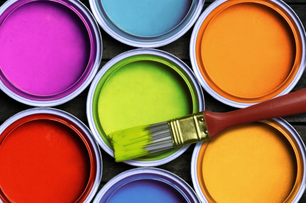
The psychology of colors
Black
Black has always been related to luxury and elegance. Maybe, stay away from an all-black interior because it can get overwhelming. But, you can use this color perfect for accents. Appliances look expensive in black. This also works great with furniture.
White
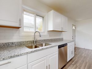
White is a go-to color for walls. It is associated with purity and cleanliness. An all-white interior is popular especially with people who like the Scandinavian style. Just be smart about adding accents because an all-white interior can look dull and lifeless.
Brown
Speaking of accent, brown is perfect for that. This color has that homey effect. Adding brown makes any space feel warmer. Brown easily matches any color so it’s perfect for furniture and home decor.
Red
The tricky part of using bold colors such as red is that every tone exudes a different effect. Overall, the color red oozes energy so it’s perfect for living spaces. Deep red such as crimson are dramatic while rusty reds are cozy.
Orange
You rarely see orange walls in houses. It’s because big amounts of orange are too flashy. Orange is an energetic color but too much of it can overwhelm your eyes. But, if you go a few tones down, peach is a nice color to play with. It’s the right amount of warmth and energy.
Yellow
Yellow is a happy color. It can bring you energy and happiness. But like orange, you have to find the right tone of yellow especially if you are gonna use it on walls. Bright yellow, on the other hand, creates a perfect contrast with dark walls so you can definitely have a bright, energetic yellow sofa.
Green
Green looks healthy and rich. It makes you think of nature. Deep tones of green like emerald have a rich and elegant effect. You can have an accent wall of dark green next to white walls. Lighter tones of green are relaxing and can be used to paint huge areas. Sage green, for example, can be used for bedrooms.
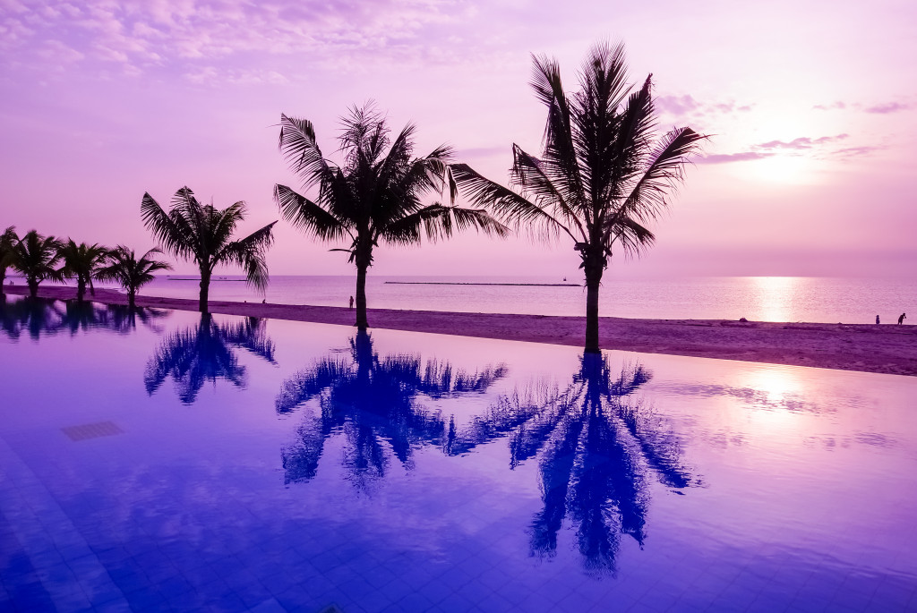
Blue
Blue is generally a calming color. Dark tones of the blue like navy look classic and masculine. Whereas lighter colors such as powder blue are calming and relaxing.
Purple
Purple is a rich color that’s why it has always been associated with royalty. Dark purple colors like plum have a rich and exotic effect. Lavender, on the other hand, is very calming.
This is just a guide to help you decide on the colors for your home. At the end of the day, the decision is all yours. Go with colors that best express yourself.